728x90
반응형
데이터를 웹 애플리케이션에 시각화할 때, Streamlit은 간단하면서도 효과적인 기본 차트를 제공합니다. 이번 글에서는 임의의 데이터를 생성하고 Streamlit을 사용하여 다양한 차트로 시각화하는 방법을 소개합니다.
데이터 생성하기
NumPy를 활용하여 30x3 크기의 랜덤 데이터를 생성하고, 이를 pandas 데이터프레임으로 변환합니다.
myData = np.random.randn(30,3)
df = pd.DataFrame(data=myData, columns=['a','b','c'])
1. 선 차트(Line Chart)
데이터프레임의 각 열을 시계열 또는 순차적 데이터로 해석하여 선 차트를 그립니다.
st.line_chart(df)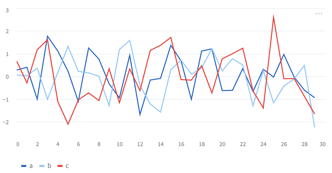
2. 영역 차트(Area Chart)
선 차트와 유사하나, 각 선 아래의 영역을 채워 시각화합니다.
st.area_chart(df)
3. 막대 차트(Bar Chart)
데이터프레임의 각 행을 막대로 나타내는 차트를 그립니다.
st.bar_chart(df)
시각화 예제
간단한 EDA를 해보겠습니다.
df = pd.read_csv('data_iris.csv')
st.write(df.head())

count = df['Species'].value_counts()

fig1 = plt.figure(figsize=(7,5))
plt.bar(x=count.index, height=count.values, color='orange')
plt.ylabel('counts')
st.pyplot(fig1)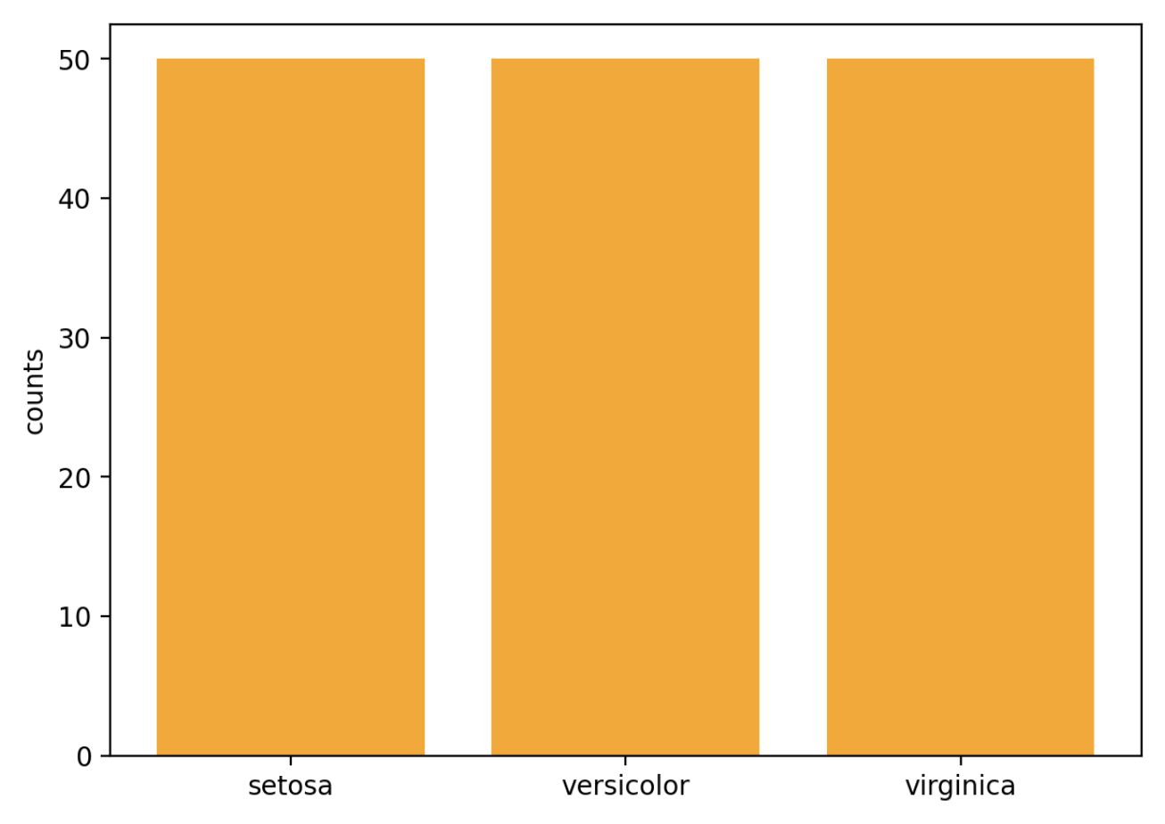
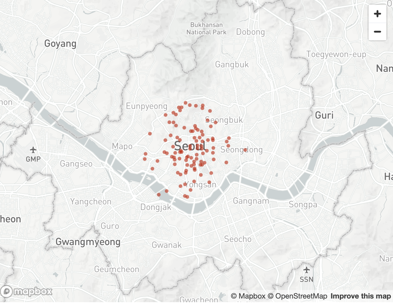
지도 시각화와 같은 조금 더 복잡한 시각화도 가능합니다.
myData = {'lat':[37.56668], 'lon':[126.9784]}
for _ in range(100):
    myData['lat'].append(myData['lat'][0] + np.random.randn()/50.0)
    myData['lon'].append(myData['lon'][0] + np.random.randn()/50.0)

st.map(data=myData,zoom=10)
728x90
반응형
'APP > Streamlit' 카테고리의 다른 글
| [Streamlit] Streamlit을 사용한 붓꽃 데이터 시각화 프로젝트 (0) | 2023.08.09 |
|---|---|
| [Streamlit] Streamlit의 기초! 파일 올리고 내려받기 (0) | 2023.08.09 |
| [Streamlit] Streamlit의 기초! 타이머 구현하기 (0) | 2023.08.09 |
| [Streamlit] Streamlit의 기초! Expander (0) | 2023.08.09 |
| [Streamlit] Streamlit의 기초! Column과 Tab을 사용한 Layout (0) | 2023.08.09 |


